Product · Optimisation

Device Card CTR Uplift

Improving device comparison and selection within the mobile purchase journey.

Product

Optimisation

Experimentation

Evidence-led

Accessibility

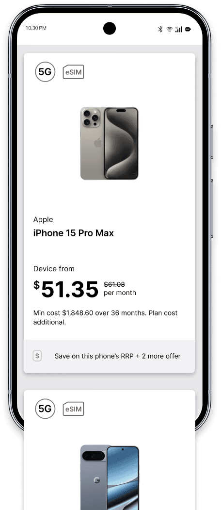
Before-and-after device card comparison showing increased information density and scannability.
Device Card CTR Uplift hero illust

Overview

Role

Product Designer

Brand

Vodafone

Focus

Product Optimisation & Experimentation

Methods

A/B Testing, Usability Testing, Workshops, Behavioural Analytics

Outcome

50% CTR uplift validated through live A/B experiment

Timeline

Q2, 2024

The Challenge

The product card size on the mobile listing page was large enough to fill the whole screen on many devices. This made it difficult for users to browse and compare multiple phone models efficiently, increasing cognitive load and reliance on memory to evaluate options across the catalogue.

The product card size on the mobile listing page was large enough to fill the whole screen on many devices. This made it difficult for users to browse and compare multiple phone models efficiently, increasing cognitive load and reliance on memory to evaluate options across the catalogue.

Business Requirements

Increase click-through rate on device listing page

Increase click-through rate on device listing page

Improve browsing efficiency and comparison clarity

Improve browsing efficiency and comparison clarity

Maintain data granularity and regulatory disclosure requirements

Maintain data granularity and regulatory disclosure requirements

Deliver a scalable, accessible component for the device catalogue

Deliver a scalable, accessible component for the device catalogue

Challenges

Inefficient Vertical Space — large card dimensions limited the number of visible options, forcing a linear and repetitive browsing experience

Inefficient Vertical Space — large card dimensions limited the number of visible options, forcing a linear and repetitive browsing experience

Limited Scannability — the layout hindered the ability to compare device specifications efficiently across multiple models

Limited Scannability — the layout hindered the ability to compare device specifications efficiently across multiple models

High Interaction Cost — excessive scrolling and reliance on memory to compare items increased cognitive load and mental strain

High Interaction Cost — excessive scrolling and reliance on memory to compare items increased cognitive load and mental strain

Risks & Constraints

Regulatory disclosure requirements — minimum information display requirements for device pricing, plan costs, and minimum total cost over contract period were non-negotiable. Reducing card size could not come at the expense of required disclosures.

Design system compatibility — the redesigned component needed to integrate with the existing Vodafone design system and scale across the full device catalogue, not just the tested subset.

BAU parity requirement — the redesign needed to maintain at least 79% usability parity with the existing card to satisfy internal acceptance criteria before any live experiment could proceed.

Platform migration context — this work was completed as part of an experimental initiative during a platform migration period. Full implementation was deferred due to platform migration priorities.

MY ROLE

What I owned

End-to-end product design across the card redesign — from problem framing and competitive analysis through to concept exploration, stakeholder workshops, prototyping, A/B test design, and usability testing. I defined the success metrics, designed the split-test protocol, and owned all design decisions across the six layout variations explored.

What others owned

Engineering implemented the A/B test variant and managed the live experiment infrastructure. Data and analytics teams defined the CTR measurement methodology and validated the experiment results. Product managed scope and sign-off on the experiment brief.

My Approach

Understand

Analysed behavioural data and session recordings to identify where users were dropping off and what information they were seeking but not finding on the existing device listing page. Established baseline metrics — 2.5% CTR, 88% task completion, high scrolling friction.

Analysed behavioural data and session recordings to identify where users were dropping off and what information they were seeking but not finding on the existing device listing page. Established baseline metrics — 2.5% CTR, 88% task completion, high scrolling friction.

Align

Designed a split-test protocol to validate whether reducing card height would improve CTR — turning the experiment into a data-driven case for the redesign. Facilitated stakeholder workshops to reach alignment on information hierarchy, balancing business requirements with user scannability. Defined KPIs targeting a considerable increase in CTR as the primary benchmark.

Designed a split-test protocol to validate whether reducing card height would improve CTR — turning the experiment into a data-driven case for the redesign. Facilitated stakeholder workshops to reach alignment on information hierarchy, balancing business requirements with user scannability. Defined KPIs targeting a considerable increase in CTR as the primary benchmark.

Design

Explored six layout variations to resolve visual density and improve scannability. Tested diverse Savings Pill treatments for promotional devices. Reduced vertical footprint by 30% while maintaining data granularity and improving information scannability. Prioritised comparison clarity over visual promotion — deferring the Savings Pill as a future opportunity.

Explored six layout variations to resolve visual density and improve scannability. Tested diverse Savings Pill treatments for promotional devices. Reduced vertical footprint by 30% while maintaining data granularity and improving information scannability. Prioritised comparison clarity over visual promotion — deferring the Savings Pill as a future opportunity.

Validate

Confirmed the compact layout outperformed the legacy baseline in a live A/B experiment with 58% relative CTR uplift. Refined the design through qualitative feedback from 25 usability testing participants. Iterated from initial to final design based on findings — improving selection efficiency by 38% and achieving 100% comprehension in the final round.

Confirmed the compact layout outperformed the legacy baseline in a live A/B experiment with 58% relative CTR uplift. Refined the design through qualitative feedback from 25 usability testing participants. Iterated from initial to final design based on findings — improving selection efficiency by 38% and achieving 100% comprehension in the final round.

Key Decisions

Before

Before

Large card filling the full screen viewport, high scrolling friction, 2.5% CTR baseline, 88% task completion.

Difficult to Compare

Device card original

After

After

Compact card with optimised information hierarchy, 5.1% CTR in A/B test, 100% task completion, 18% faster device selection.

Optimised & Scannable

Device card experimental

Adopt Shorter Card Dimension

The core decision validated by the A/B experiment. Reducing vertical height increased viewport density and browsing efficiency without losing required information.

Savings Pill Deferred

Eye-catching but conflicted with the primary goal of reducing cognitive load. Prioritised comparison clarity over visual promotion. Identified as a future opportunity.

Standardised Card Component

Built for scalability and accessibility across the full device catalogue, not just the tested variants.

Maintained BAU Parity

Preserved 79% usability parity with the existing card to satisfy internal acceptance criteria before proceeding to live experiment.

Validation

Validated through a live A/B experiment against the legacy baseline and usability testing across two rounds of mockup iteration.

Live A/B Experiment

Confirmed the compact layout outperformed the legacy baseline under real-world conditions.

Confirmed the compact layout outperformed the legacy baseline under real-world conditions.

50%

CTR Increase

CTR Increase

CTR Increase

2.5% → 5.1%

2.5% → 5.1%

10%

Faster device selection

Faster device selection

100%

Task completion

Task completion

Usability Testing (n=25)

Iteratively refined the design through qualitative and quantitative feedback across two rounds of testing.

Iteratively refined the design through qualitative and quantitative feedback across two rounds of testing.

30%

Selection efficiency

Selection efficiency

10% → 30%

10% → 30%

100%

Pricing comprehension

Pricing comprehension

80%

Visual appeal

Visual appeal

52% → 80%

52% → 80%

Outcome & Impact

The redesigned device card was validated through a live A/B experiment and usability testing, demonstrating a 50% CTR uplift and improved task completion. Full implementation was deferred due to a platform migration; wireframes shown here were recreated for portfolio purposes.

The redesigned device card was validated through a live A/B experiment and usability testing, demonstrating a 50% CTR uplift and improved task completion. Full implementation was deferred due to a platform migration; wireframes shown here were recreated for portfolio purposes.

50% CTR Uplift

Validated through live A/B experiment against the legacy baseline.

Validated through live A/B experiment against the legacy baseline.

Improved Comparison

Users could evaluate multiple devices simultaneously without excessive scrolling.

Users could evaluate multiple devices simultaneously without excessive scrolling.

Scalable Component

A scalable, accessible card component built for the full device catalogue.

A scalable, accessible card component built for the full device catalogue.

WCAG Accessibility

Repositioned icons, improved information hierarchy, and maintained WCAG compliance throughout.

Repositioned icons, improved information hierarchy, and maintained WCAG compliance throughout.

AI in my practice

AI tools supported my work in synthesising usability testing observations, exploring copy variations for pricing disclosure language, and accelerating component variant exploration during the design phase.

AI tools supported my work in synthesising usability testing observations, exploring copy variations for pricing disclosure language, and accelerating component variant exploration during the design phase.

Tools used

Figma AI

Figma AI

Microsoft Copilot

Microsoft Copilot

UserTesting

UserTesting

Figma AI

Figma AI

Used to accelerate early exploration of the six layout variations during the concept phase, generating component variants for review before manual refinement.

Used to accelerate early exploration of the six layout variations during the concept phase, generating component variants for review before manual refinement.

UserTesting AI

UserTesting AI

Used to summarise participant observations across two rounds of usability testing and compare findings against manual qualitative analysis.

Used to summarise participant observations across two rounds of usability testing and compare findings against manual qualitative analysis.

Microsoft Copilot

Microsoft Copilot

Used to explore plain language alternatives for pricing disclosure copy within the compact card layout, testing readability across different levels of information density.

Used to explore plain language alternatives for pricing disclosure copy within the compact card layout, testing readability across different levels of information density.

Tools used

Figma AI

UserTesting

Microsoft Copilot

AI in my practice

AI tools supported my work in synthesising usability testing observations, exploring copy variations for pricing disclosure language, and accelerating component variant exploration during the design phase.

Tools used

Figma AI

Microsoft Copilot

UserTesting

Figma AI

Used to accelerate early exploration of the six layout variations during the concept phase, generating component variants for review before manual refinement.

UserTesting AI

Used to summarise participant observations across two rounds of usability testing and compare findings against manual qualitative analysis.

Microsoft Copilot

Used to explore plain language alternatives for pricing disclosure copy within the compact card layout, testing readability across different levels of information density.

Tools used

Figma AI

UserTesting

Microsoft Copilot

Reflection

This project reinforced the value of validating design decisions with evidence rather than assumptions. Designing within a mature product required balancing business objectives, usability, and technical constraints without disrupting an established experience. It strengthened my belief that meaningful improvements often come from refining the details that customers interact with every day.

More case studies

Illustration of a digital eSIM activation journey across purchase, preparation, activation and connection.
Prepaid eSIM Activation thumbnail

Journey · Transformation

Prepaid eSIM Activation

Extending eSIM capability to prepaid customers within a decade-old legacy platform.

View Case Study

Illustration of NBN ownership verification within a home internet checkout journey.

Regulatory · Validation

NBN Transfer Compliance Experience

Integrating regulatory ownership verification into the NBN sign-up journey without increasing checkout friction.

View Case Study
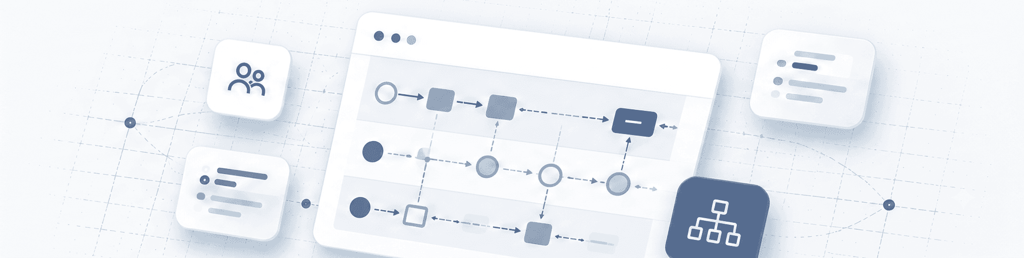
Service blueprint showing links between customer touchpoints, teams, systems and operational processes.

Service · Systems

Service Journey Blueprinting

Mapping service dependencies and operational touchpoints to enable cross-functional alignment.

View Case Study

Available for Product Design opportunities, consulting and collaboration.